Nasdaq
Product Redesign
End to End
UX Research
Timeline
10 Weeks
Role
Product Designer
Tools
Figma
Problem
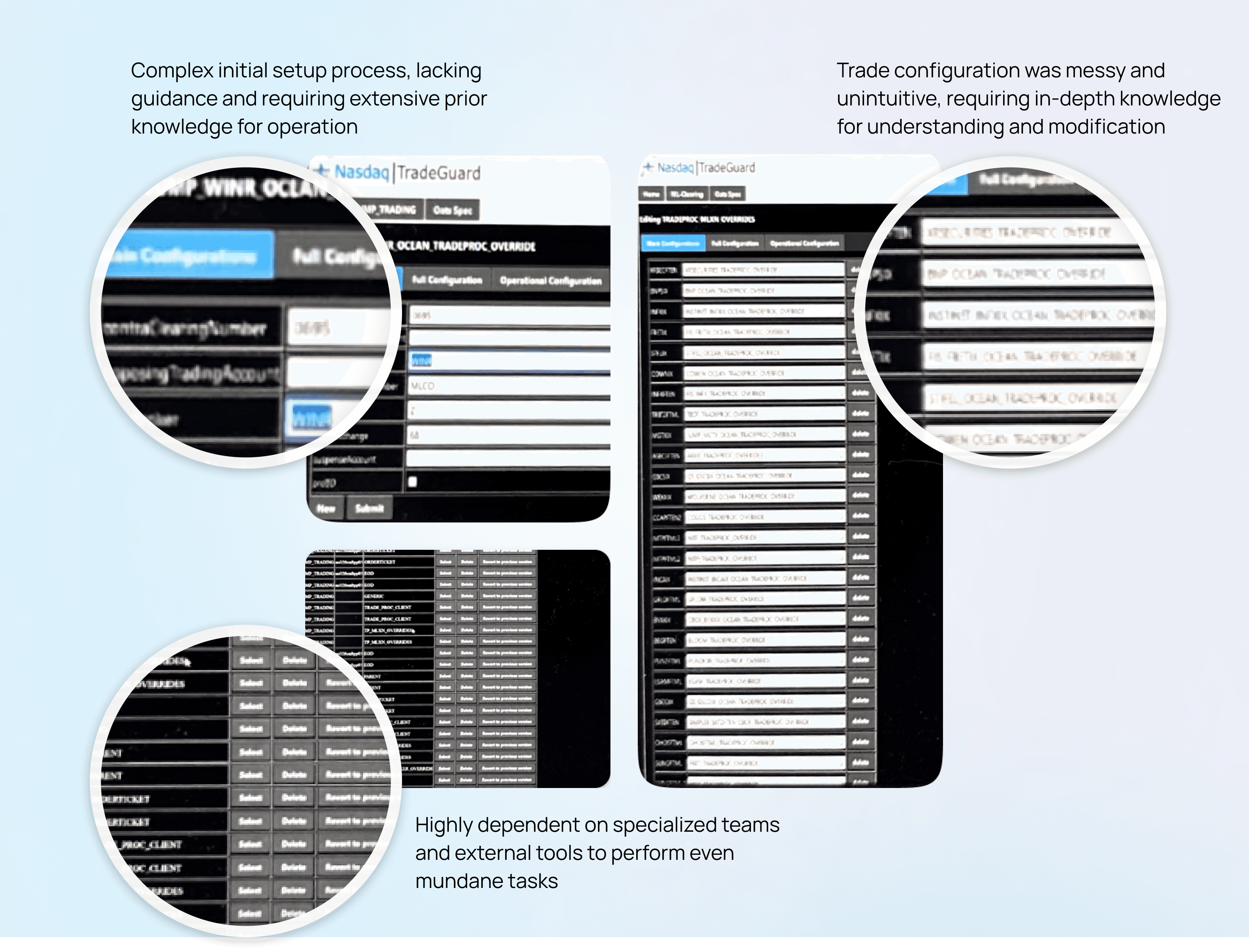
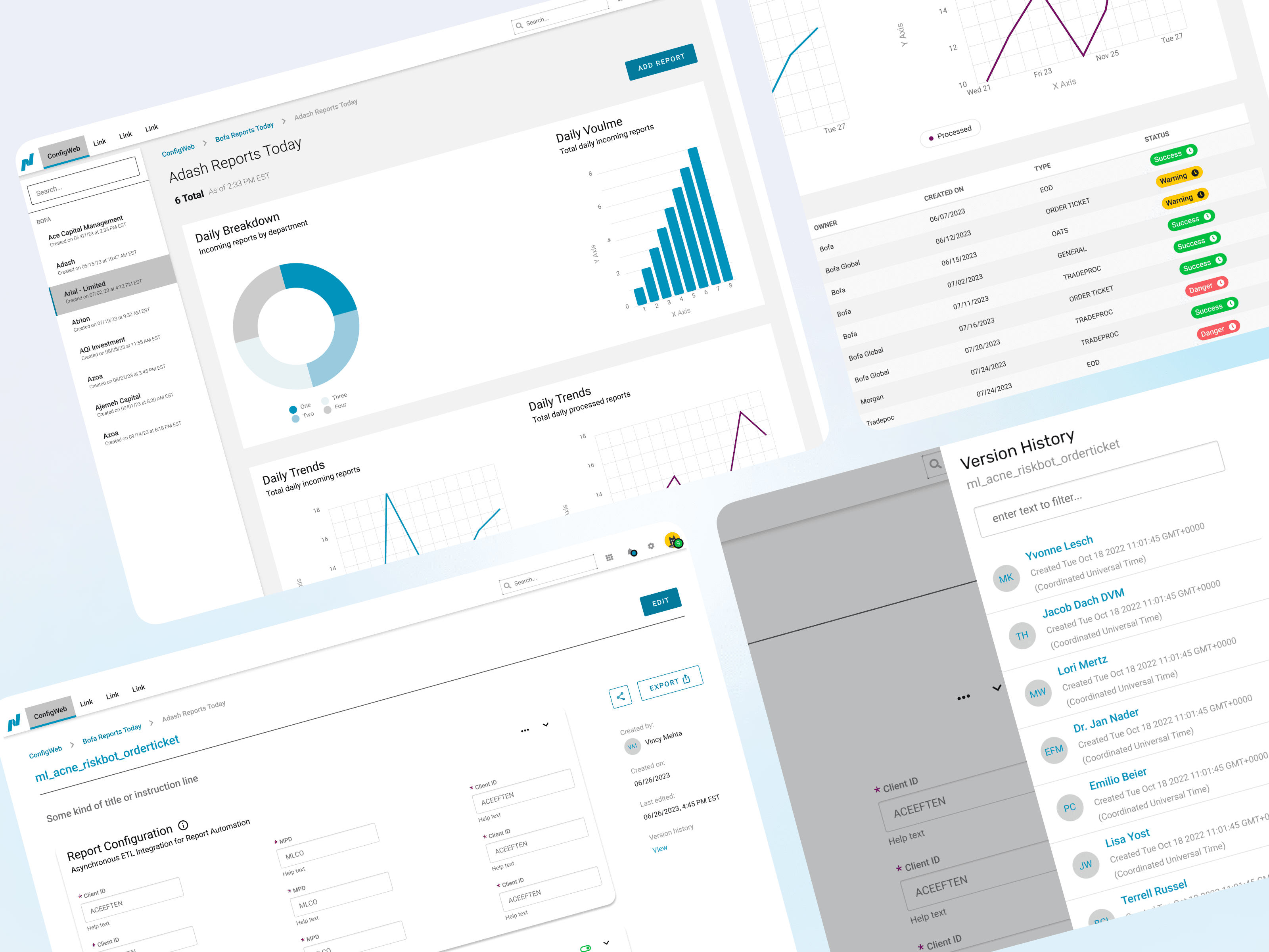
Nasdaq’s internal self-serve tool, used by Bank of America for configuring reports and managing data, required a complete overhaul due to its outdated interface, accessibility issues, and high error rates. The tool was difficult for non-technical users to navigate and lacked a cohesive structure. The goal was to simplify the interface, improve usability, and create a more consistent way of accessing and managing data. Extensive research was conducted by reviewing documentation and user feedback, which informed the development of user personas, journeys, and a new architecture for the tool.
Transforming Data Management for Financial Services
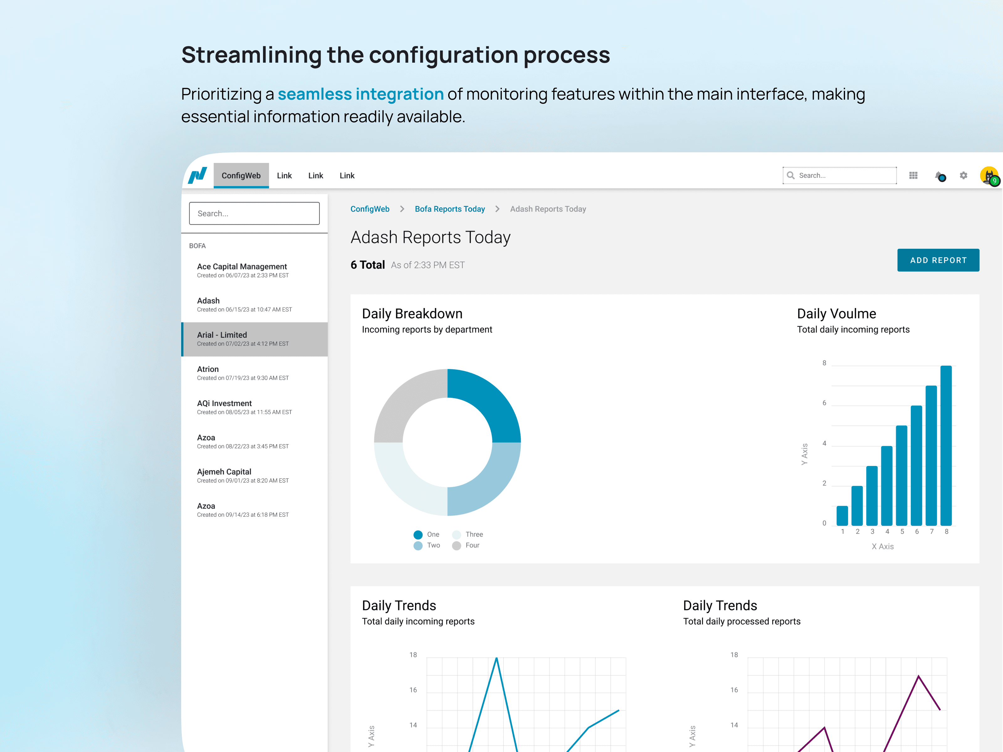
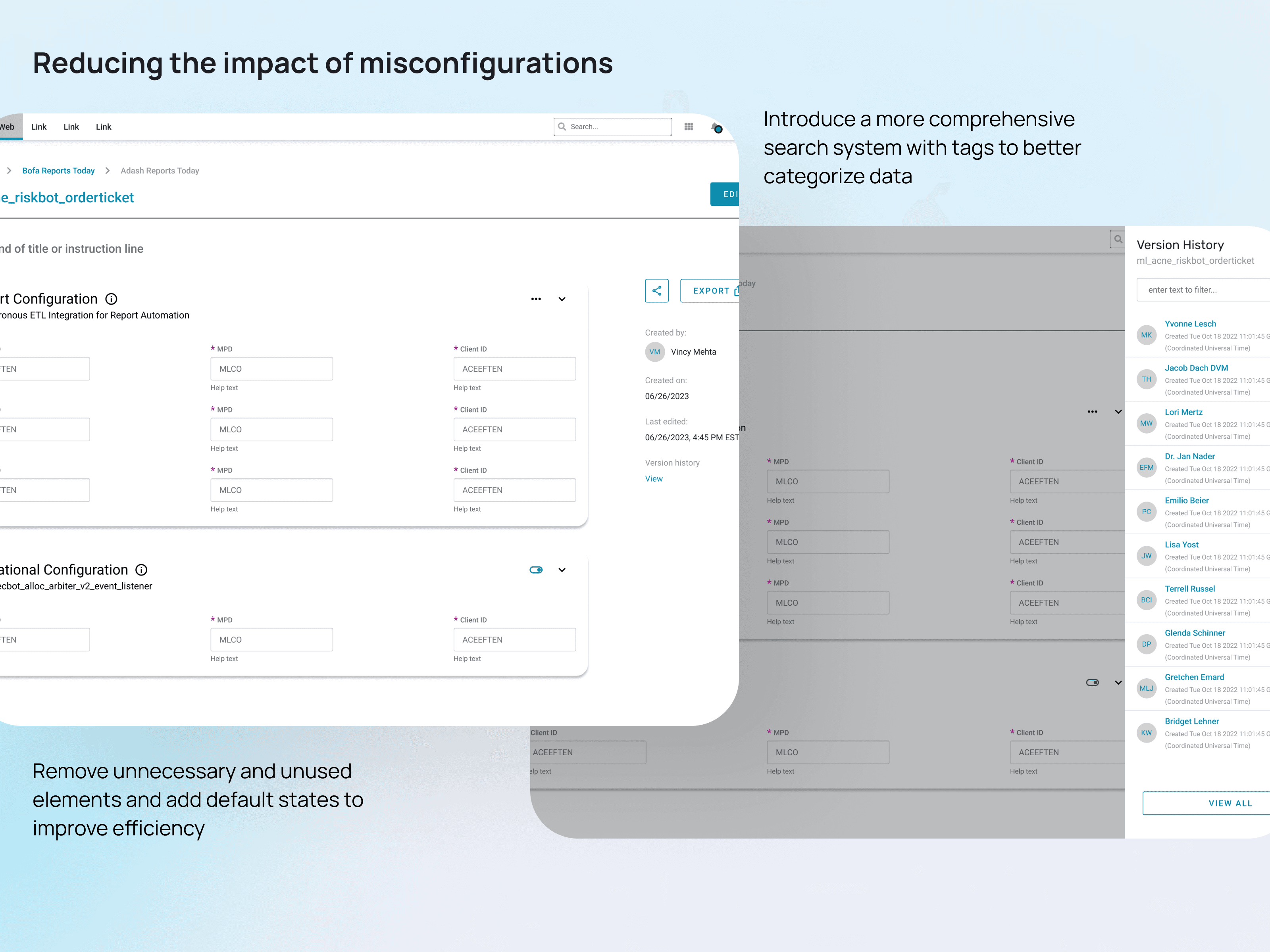
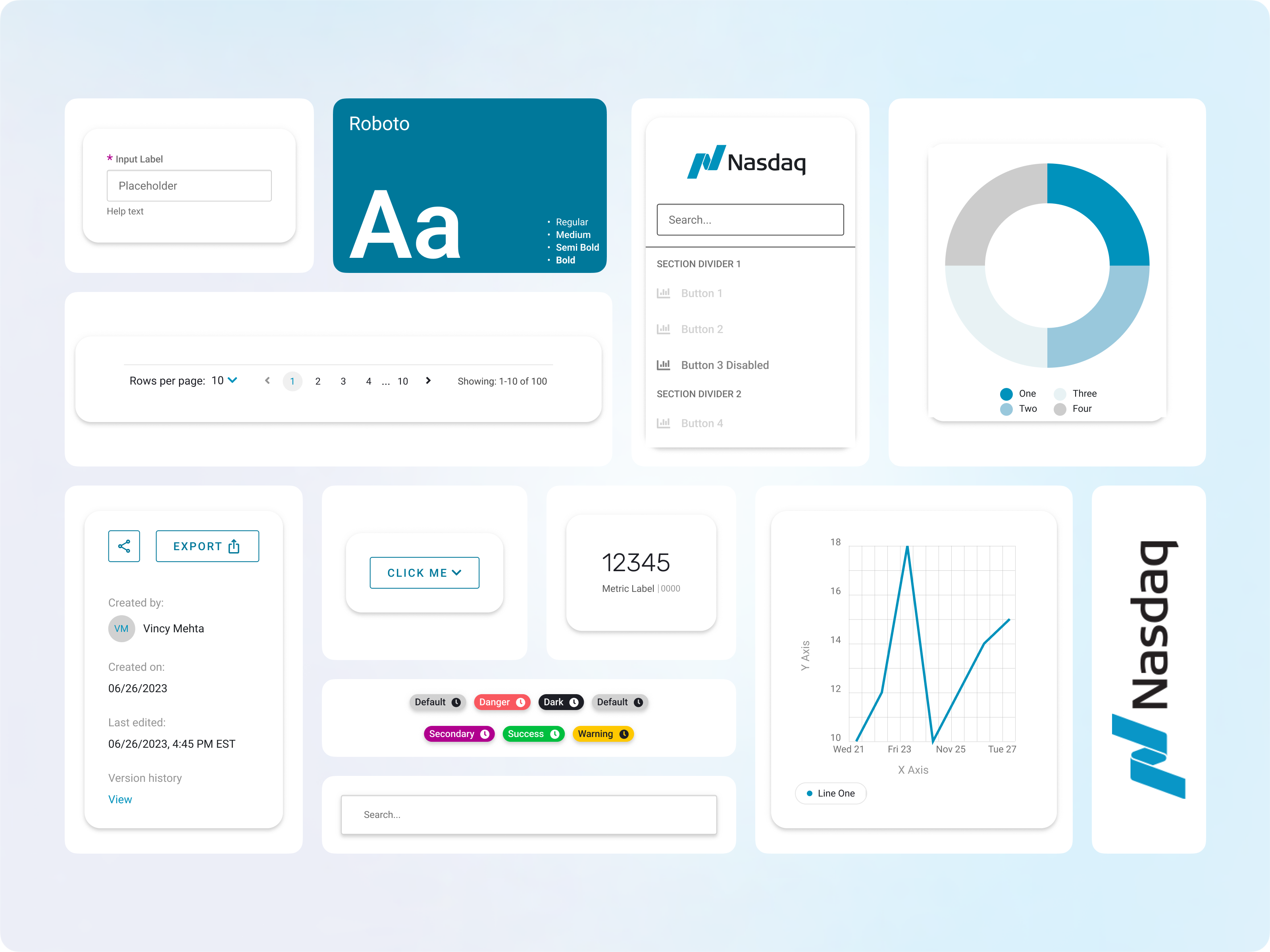
The redesign focused on standardizing how users interacted with the tool. Consistent data filtering, sorting, and navigation patterns were introduced to make the tool more predictable and efficient. Low- and mid-fidelity wireframes were created to outline the new structure, followed by high-fidelity prototypes that brought the design to life. Feedback loops with engineers ensured the designs were technically sound while enhancing the user experience. The final product dramatically improved accessibility and reduced user errors, delivering a more streamlined and efficient solution for managing reports and data.
